Color Theory Guide
Looking to have more influence on the look and feel of your artworks and coloring? Learning more about color theory can help you navigate color mixing and pairing to get results closer to how you want. Effective use of color theory unlocks many options for you as an artist, enabling you to create art with more direction and purpose. Because color theory is a deeply complex topic, this guide will serve as an overview and quick reference to many concepts, but we encourage you to continue to learn about this fascinating topic with more in depth sources.
Before we can talk color theory though, it can be helpful to define the characteristics/attributes of color. When talking about colors, we usually describe them using color terms we learned back from pre-school and kindergarten. These terms are useful but lack in specificity when working with color. To get more accurate color names, we might use tools like the Pantone Color Naming System to reference a specific color. However, this guide is more interested in providing the skill of being able to accurately describe color using its attributes over the ability to match a color you see with a color name. To define relations we will be using a color wheel and to define the attributes we will using Hue, Saturation, and Value.
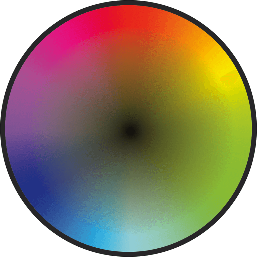
Color wheel: A tool used to help visualize spatial relationships between different hues. The color wheel is helpful because we can at a glance see different regions of color and how near or far they are to other regions of color.
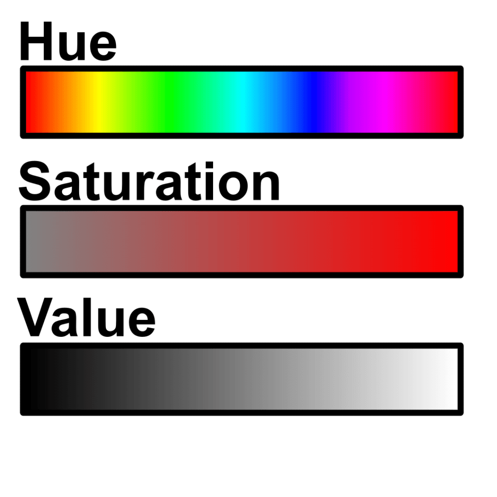
Hue: Describes the color region we are looking at from the color spectrum (e.g. red). Although hue is a continuous value, to get accurate color descriptions, we will be defining specific color regions from primaries down to tertiaries. By using specific regions as reference points it makes it easier to describe colors you see.
Saturation: Describes how intense a color is. For instance, maybe you had a very vivid sky blue article of clothing, but after many many washes, it no longer has that same intensity. To understand the saturation, it can also be helpful to think of how muddy the color is you are looking at (does the color look more gray or more vibrant?).
Value*: Describes how light or dark a color is. Value is what you see in black and white filters, the color is stripped back and the value (lightness/darkness) of the colors are what remains.
*Note that 2 different fully saturated colors can have different values. The most vibrant red has a deeper value than the most vibrant yellow (you can barely see it against the page!).
Additive & Subtractive Models:
Along with being able to describe colors using these attributes, it is helpful to have a brief overview of the additive and subtractive color models.
The additive model is what is used in digital displays, and leverages pixels that emit wavelengths in the RGB (red, green, and blue) range. The colors in digital displays use a ratio of these 3 colors to describe all the ones we can see on a screen.
The subtractive model is how we mix colors with physical reflective media like paints. It is much more difficult to mix colors accurately in the subtractive model because pigments combine and behave very differently than light. This added difficulty and historic accessibility resulted in different sets of primary colors, most significantly a divide between vibrant and natural primary color choices.
In these examples of the subtractive model we can see that the ball acts like a filter for the white light. Every wavelength except the ones reflected are absorbed. When mixing paints, we are filtering out light. Because of this, it is valuable to be calculated in our paint selection so we can mix both vibrant and muted colors.
Primary Colors:
Defining primary colors is challenging because there are many common definitions with separate qualifications for what makes a color a primary color. These definitions usually boil down to primaries are colors that cannot be mixed from other colors or the primary colors are a set of colors that can mix any other color. Because this guide is intended to help artists use color theory in their own art, our definition relates how the primaries we choose impacts how we relate colors to each other.
For the purpose of this guide, we describe the primaries as a set of 3 colors that are the foundation of a color wheel. We will talk about two prominent primary color sets used today and the significance of the color wheels resulting from these primaries. These color sets are RYB (red, yellow, and blue) and CMY (cyan, magenta, and yellow).
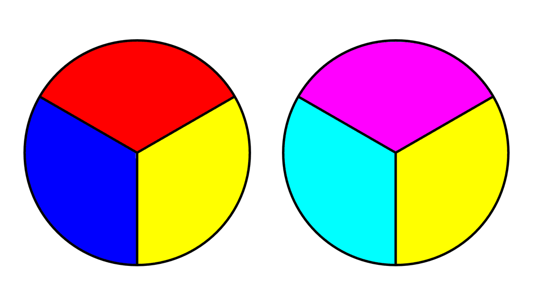
RYB are the traditional primaries and are likely the ones you learned about growing up. They are common in traditional art and have more historical roots, but also have a smaller gamut and tend to mix more muddy/neutralized colors. CMY are what we will refer to as the modern printing primaries because you can commonly encounter them when doing screen printing for t-shirts and typical home paper printers. The modern printing primaries will mix clearer colors along a wider gamut, but have less prominent historical roots.
These two common models have implications in color theory and understanding them may help enable artist to get the visual effects/feelings they want out of their artwork. Because both sets result in different color wheels, the relationships between colors differ. Depending on the effect the artist wants, it may be more useful to pick one model over another.
Traditional Primaries
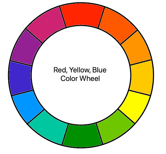
Take a look at this traditional primaries color wheel. The hues* red, yellow, and blue are evenly spaced with a spectrum of hues in-between. These in-between hues are called the secondary and tertiary colors. Each of these hues will be given a name* to help describe relations.
The secondary colors are the ones directly opposite of the primaries, in the case of the traditional primaries wheel, these hues are: green, purple, and orange.
Once we add the tertiaries, we get these color categories and names:
- Primaries:
- Red
- Yellow
- Blue
- Secondaries:
- Green
- Purple
- Orange
- Tertiaries:
- Scarlet
- Amber
- Lime
- Teal
- Violet
- Crimson
The traditional primaries color wheel has a few benefits. One major benefit is how the colors relate to each other in paint/color mixing. We know from experience that yellow and blue make green, red and yellow make orange, and red and blue make purple. Additionally, mixing these primaries will lead to many colors you see in nature, making certain subjects easier to represent using traditional primaries.
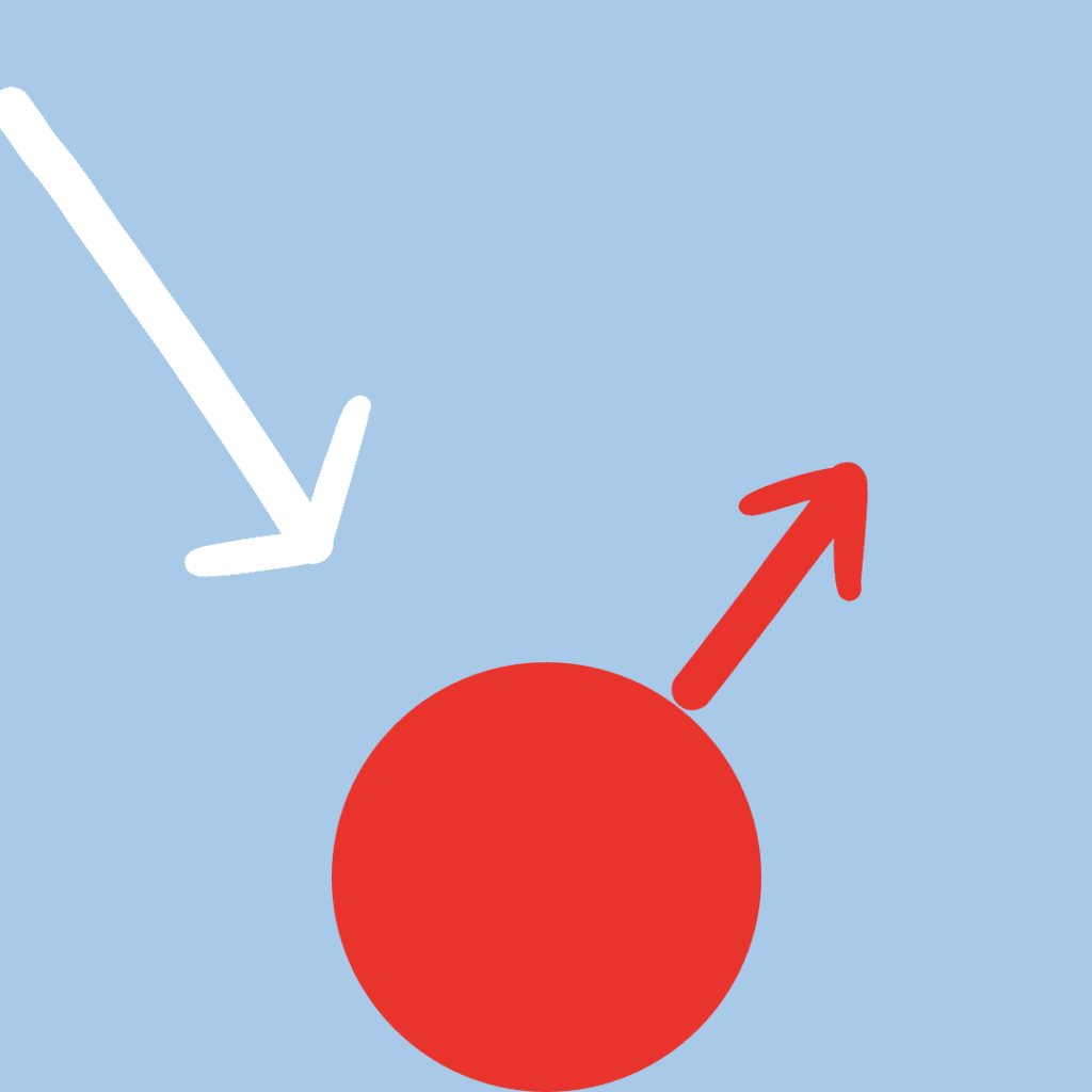
It also has some cons. The biggest cons are if you want to use vibrant colors that these primaries cannot mix, such as magenta and cyan. They will always be muted when trying to mix with RYB. For instance, when we look at colors on the opposite side of the wheel we call them complements.
In this color wheel we see red and green at the opposite sides of the wheel so it may seem like they are the furthest in the way we perceive colors. However, red and cyan are more distant for our color perception. Interestingly, we can find out which colors are opposite by staring at them. If you stare at a decently bright screen that is red, and then stare at a blank/white wall or screen you will see the afterimage in cyan not green. If your eyes are sensitive to straining we recommend scrolling past the image.

*We say hue instead of color to further the fact we are talking about a region of the color wheel, but they are interchangeable on a discrete wheel like this
*The names we chose are arbitrary, different online resources will give their own names to these hues. Feel free to use the names we picked or names you pick yourself. Ideally, they are easy to remember and accurately describe the hues.
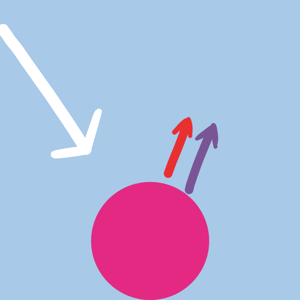
Modern Printing Primaries
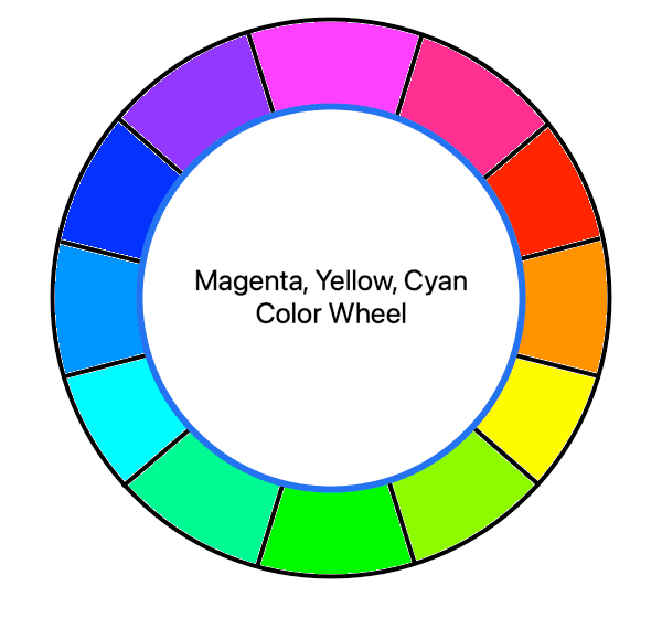
Next up we will talk about the modern printing primaries. The major change here is the use of cyan and magenta for primaries instead of blue and red. The secondary hues may be familiar as directly opposite to our primaries we have RGB (red, green, blue-violet), the very same we use in digital screen displays.
With the Modern Printing Primaries we get a breakdown of:
- Primaries:
- Cyan
- Magenta
- Yellow
- Secondaries:
- Red
- Green
- Blue (blue-violet)
- Tertiaries:
- Rose
- Orange
- Chartreuse
- Spring Green
- Azure
- Purple
Despite having a clear and accurate color wheel, trying to predict how things mix is not representative of how colors actually mix. Many of our physical pigments do not have true complements and depending on the colors you mix you may traverse through a vibrant path (like mixing yellow and green) or a muted path (like mixing magenta and cyan). Additionally, some paints, like yellows, can be difficult to mix with because small amounts of other pigments make a large change on the mixed result.
Regardless of some drawbacks, the color wheel is still a useful tool. It helps artists leverage relationships between colors, describe colors they observe, and predict color mixtures. These qualities enable smart color selections, strong color observation/communication skills, and informed palette, medium, and pigment decisions.
Color Selection
Whether you use RYB or CYM color selection is important. When working with physical media, like paints, you may be limited in the colors on your palette. We recommend you select colors that work well with your subject matter and offer a good gamut, or range of mixable colors.
If you work with the traditional, RYB, primaries your palette may include colors like black*, white, burnt sienna, yellow, red, blue, and green. The inclusion of green opens up the gamut a lot and has many traditional roots, helping mix clear colors without feeling artificial or out of place like cyan and magenta.
While working with CMY, starting with a palette of black*, white, cyan, magenta, and yellow already offers a great gamut, but may be supplemented with a green and red to get the brightest of these colors.
Regardless of the total amount of base colors you choose to incorporate into your personal palette, with only a handful you can have an incredible amount of freedom as an artist. You don’t need every pigment that exists for you medium to create amazing pieces, but may consider getting convenience colors you find you mix often.
Gamut: describes the range of mixable colors with the pigments you have. For instance, if you only have a blue, green, black, and white. Your gamut would be fairly narrow because you would be limited to blue and green hues.
*Some artist prefer to leave out black all together because it can mix colors that appear too ashy. Instead they will use dark colors like ultramarine blue to mix deep value colors on the other side of the color wheel to neutralize saturation and deepen value.
*See previous note.
Getting Into Color Theory
A large part of color theory is understanding how we can use the attributes of color to our advantage. Some examples of advantages is how we can highlight specific focal points, emulate uniquely lit environments, contrast multiple focal points, and set the tone or mood.
Because color can do so much to change how we see the same thing, it is not easy to model into simple rules, however there are some guidelines we can use to assist us. For instance, we can start with some common relationships we see on the color wheel. These relationships are useful shortcuts that enable us to impart more meaning using color.
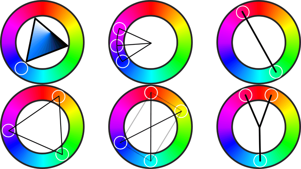
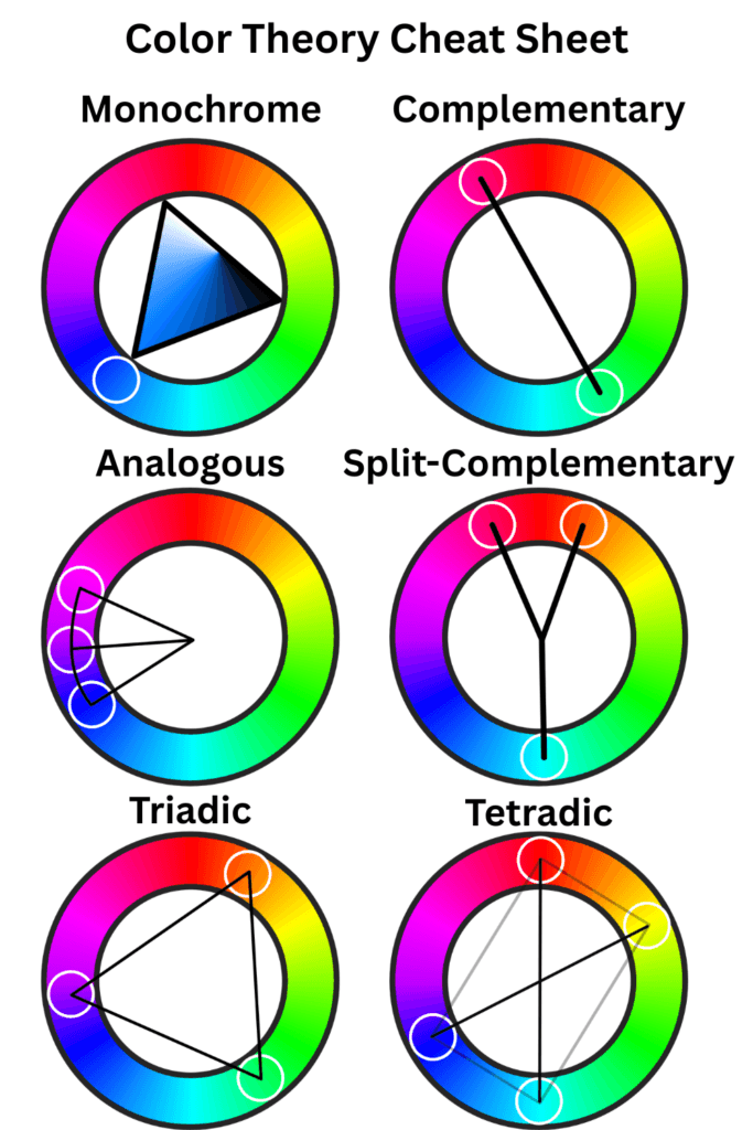
The color wheel relationships we will cover are:
- Monochromatic
- Analogous
- Complementary
- Triadic
- Tetradic
- Split Complementary
For each of these relationships, many example paintings will not mix even the analogous colors to be smooth transitions/gradients. Usually the focus of these relationships is best highlighted when the hues are distinct and deliberate, making it easiest to see the effects of these relations. However, when creating your own work the ideas behind the relationships are more important than following them as exact rules. Use these relationships as tools to further your art and creativity, enabling more options to express and innovate.
Monochromatic Relationship: The Value of Value
The monochromatic relationship is the easiest one to understand but one of the harder ones to create with. In painting it usually consists of using one pigment/color with the assistance of black and white. The use of black is to make shades and white is for making tints. Using both black and white, we can desaturate the color, making tones.
Shade: You get shades when mixing black with a pigment. This will both desaturate the color and darken its value. For example, you mix black into orange and get a brown, it is less saturated and a darker value.
Tint: You get tints when mixing white with a pigment. This will both desaturate the color and lighten its value. For example, you mix white into red and get a pink, it is less saturated and a lighter value.
Tone: A desaturated version of a color. Tones are created by adding grey to the original color.
Monochromatic paintings can use color to add meaning to paintings, but are possibly more useful for practicing mixing accurate values. Having accurate values in your art helps with visual clarity, and provide you with greater ability to express what you want with your art.
For meanings, maybe you make a monochromatic painting out of a rose colored pigment. It might remind you of looking through rose-colored glasses and bring about a more joyful piece. Or instead you might make a monochromatic piece in blue and it gives off more calming/melancholic vibes. These interpretations are more subjective and may not always land as you intend, but are useful shortcuts in cliche contexts.
Analogous Relationship: Easy Harmony
The analogous relationships is not so different from monochromatic, but provides a lot more for the artist to work with. Typically analogous uses 3 adjacent colors on the color wheel like red, orange, and yellow in addition to black and white. These pieces will usually be harmonious but can end up very saturated.
Similar to monochromatic, the analogous relationship can be used for setting the tone of a piece. However, analogous also has the advantage of being able to make a bit more cohesive and grounded pieces. Often times monochromatic pieces are going to feel heavily stylized because it is rare to only see one color in real life, but analogous can offer a more natural feeling while still being cohesive.
Using analogous colors can feel less like an art exercise and more expressive/creative. It can be a useful color relationship to use when you don’t know what to pick because the colors will always mix well, be cohesive, and can provide inspiration despite the limited options.
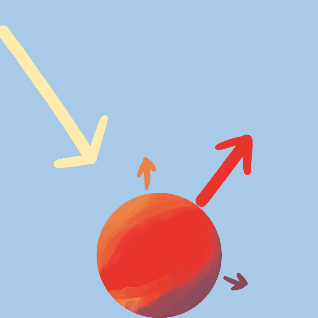
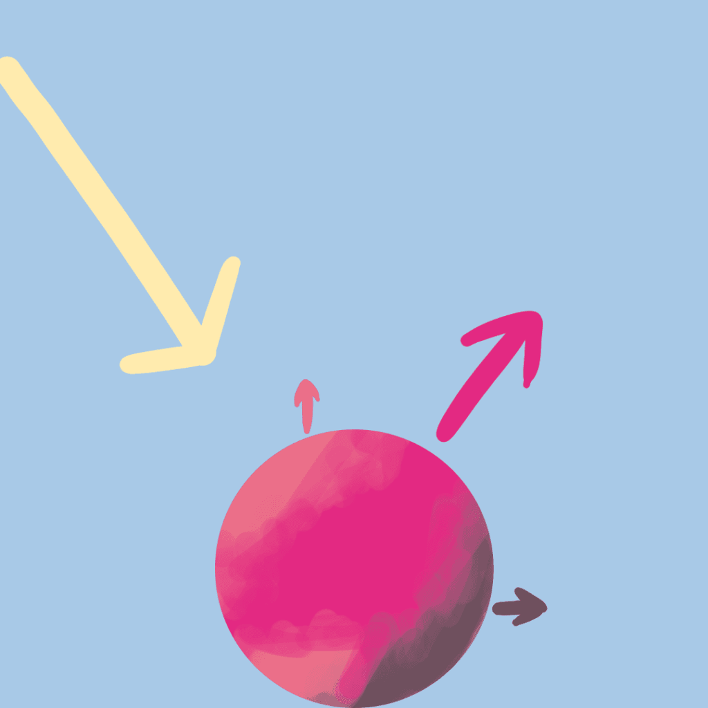
Complementary Relationship: Compare and Contrast

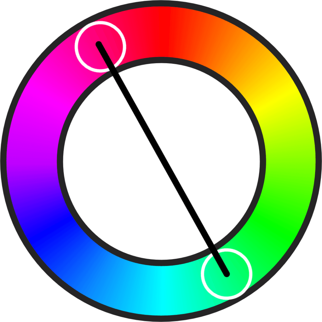
The complementary relationship is the first one where we will have a jump in hues that is significant. In fact, it is the largest jump possible as we are taking two colors on opposite sides of the color wheel. This large jump is very useful for highlighting and emphasizing a subject in a painting.
Many of the examples you can find online are paintings of fruit where the more saturated color of the fruit gets contrasted by a desaturated complement. For instance, you may see a piece where a lemon is the subject, and a grayish blue-violet color is used for the background of the piece. This large jump in hue makes the subject particularly interesting. Your eyes immediately follow to the subject and focus on the most saturated color.
Using the complementary relationship is a great way to practice directing your viewers attention using saturation. The highly saturated hearts stand out from the koala fur despite the fact they are incredibly similar in value. When striving to add visual clarity to a piece, value is probably the strongest lever an artist can pull, but saturation and complementary colors can go a long way on their own.
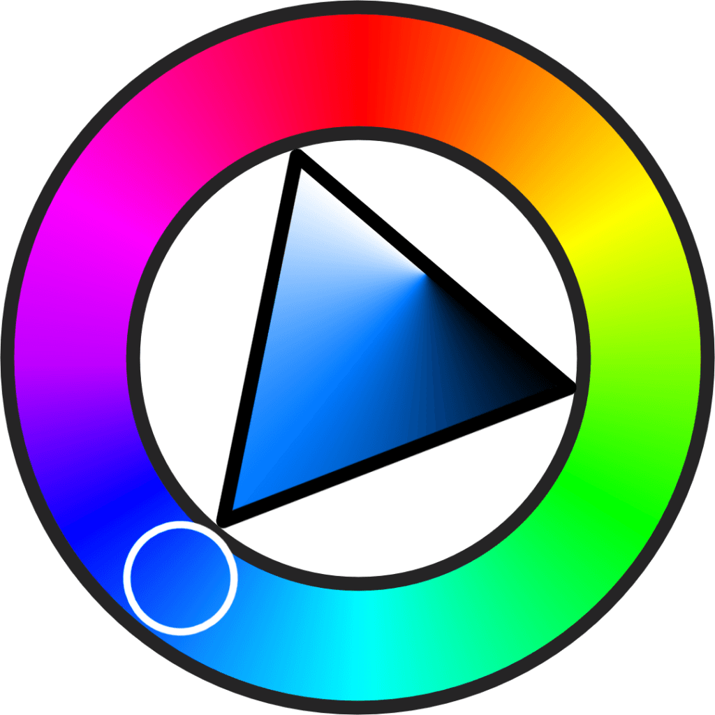
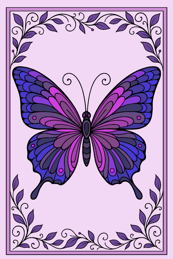
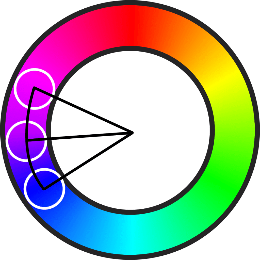
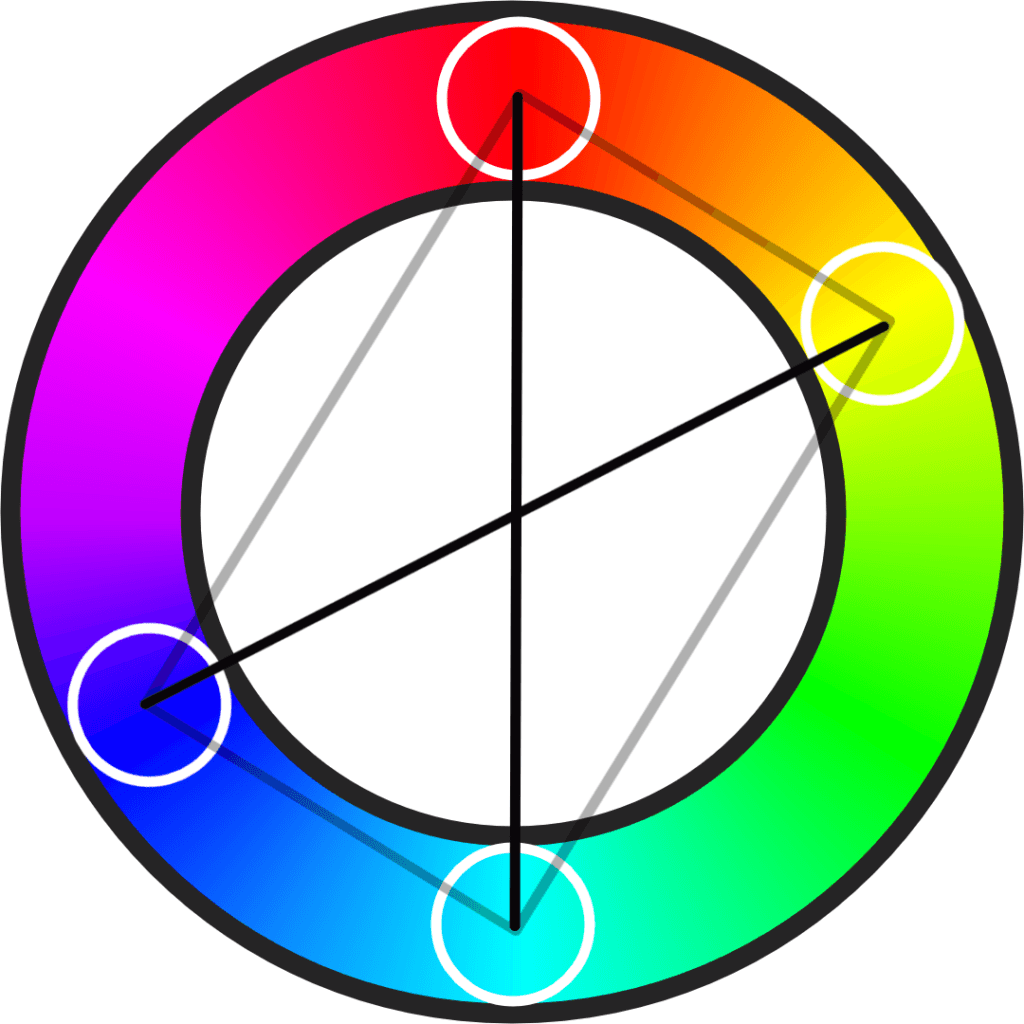
Triadic Relationship: Bold, Vibrant, and Balanced

The triadic relationship is a fun one. These are 3 colors that are close to or exactly equidistant on the color wheel. One example would be our primaries, CMY or RYB (for a traditional palette), are triadic when used together. Because these hues are always very different from each other pieces tend to be highly distinctive and a bit chaotic.
This wide shift in hues competes for attention and makes pieces feel energetic and lively. Despite them naturally competing, with thoughtful placement and distribution, harmonious and eye catching pieces can also be made. Leverage your control over saturation when working with triadic (and tetradic) relationships to keep visual balance and create opportunities for vibrant, stand out, elements. We recommend experimenting with triadic when you want your art to have high energy with a more chaotic fun feel.
Additionally, working with triadic relations may help with subject selection and placement. Because these colors contrast each other so much it provides a great opportunity to explore the composition of what you are creating and what you want to emphasize.
Tetradic Relationship: Attention Grabbing, Chaotic, and Dramatic
The tetradic relationship includes the use of many prominent hues. This is any set of 2 pairs of complimentary colors and is easiest to see when drawing a rectangle on the color wheel. The corners represent the hues, and the opposite corners demonstrate the complements. Whether you choose pairs with close colors like, cyan, blue, red, and yellow, or colors equally far apart like, azure, magenta, orange, and green, the piece will have a tetradic feel.
One of the benefits of the tetradic relationship is the dramatic feeling it invokes. These pieces can often feel chaotic and can make it so a piece has no clear subject, especially when hues are equidistant. Changing up the amounts of each hue and limiting the saturation can help a piece feel more harmonious. If you use pairs with colors close together, pieces may feel more ordered and balanced.
Using the tetradic color scheme is powerful when you want your art to draw attention to different subjects, or to make pieces feel more overwhelming and intense. It can be hard to find visual balance with this relationship so try many ideas if you are looking for something that is both chaotic and harmonious. It is great for pieces where you have many points of focus that you want to highlight, or to create a dramatic piece with the main subject competing with colorful details.
Split Complementary Relationship: Distinctive, Flexible, and Cohesive
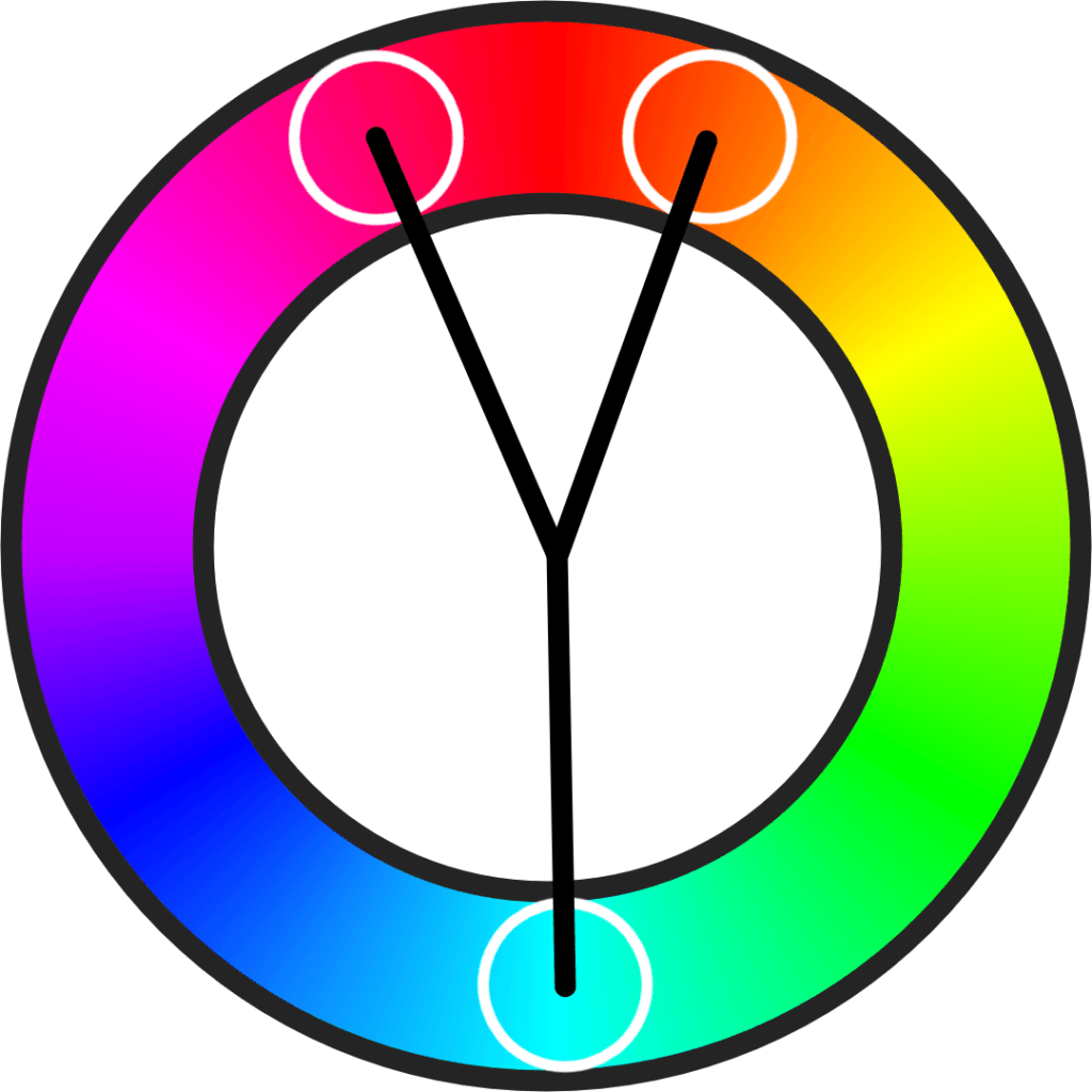
The split complementary relationship modifies the complementary relationship by taking the complementary color and instead splitting it into the adjacent hues. To figure out which colors make up a split complementary, you can draw a narrow triangle over the color wheel or split a line that would approach the complement.
This split gives a little more freedom to the artist than the complementary relationship while maintaining the high contrast. This helps create striking pieces with more developed details than the normal complementary relationship allows for.
Take inspiration from this relationship when you want your pieces to not be overwhelming but still be distinctive. This relationship can be surprisingly forgiving when it comes to composition and the amount of each hue. You can keep an equal balance of the colors or highlight the lone color or the pair and end up with a comprehensive piece.
Warm & Cool Colors
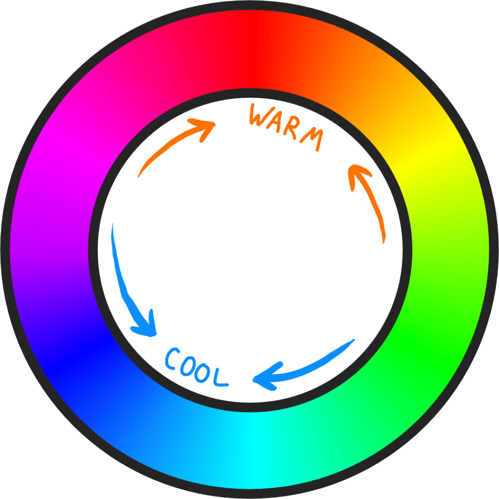
In addition to using these color relationships, it is helpful to understand how color can set the warmth of a piece. Separating the color wheel into warm and cool colors has evolved from a history from the 18th and 19th centuries. Because of this storied history, we can see that understanding colors through this lens is valuable, even if it feels arbitrary at times.
When we think of warm and cool colors, we may think of paintings or movie scenes where these colors dominate. Directors may use these colors as a shortcut with a sienna filter to signify warmth and a blue filter to signify the cold, but where does this seemingly arbitrary system come from?
The differentiation of warm and cool colors is probably easiest to see in our day to day lives on a sunny day. We tend to see warm highlights and cool shadows on sunny days. This is because the suns white light gets separated when passing through earths atmosphere, letting the warm orange-yellow wavelengths pass while the blue ones scatter. This makes our sky blue but also causes a lot of ambient blue light to bring some blue to shadows while the warm light illuminates surfaces.


This also means that objects lit by the sun will have their hues shift towards a yellow-orange, and their shadows shift to a blue, so in a very literal sense they are warm and cool colors. Understanding how this phenomenon happens in real life can help us make more deliberate choices with our art, creating realistic and lively outdoor scenes. Or scenes that are a bit more surreal with colors that flip these conventions.
Conclusions
The most important thing is to enjoy the fun of creating, and this guide serves to provide more options to you and enable your creativity. Color theory at the end of the day is fairly subjective like most of art, but can provide valuable tools and shortcuts to help create the things you want. By building up your toolbox and knowledge of how to use these tools, you can gain more freedom to express what you want in your art.
All-in-all this is a relatively brief guide on color theory and does not encapsulate all that can be done with color. We encourage you to explore further the world of Color and Color Theory as we could only cover so much in this 101. Ideas like how color perception is relative, like the black/blue and white/gold dress are incredibly valuable for understanding how others will perceive your art, but are not covered in our overview. We hope this overview is helpful and inspirational for the art you want to create, whether it’s relaxing with some coloring pages or high stakes painting.